Analyzing Tree Canopy and Gentrification Changes
- Yesh Khanna
- Aug 8, 2024
- 5 min read

Updated: Aug 9, 2024
Over the summer I have been a part of Temple’s Spatial Analytics Lab, assisting Dr. Daniel Wiese’s American Cancer Society research on the correlation between tree canopy cover changes and gentrification trends in metropolitan environments. This research is a part of a larger study examining the effects of greenspaces on post-treatment recovery in cancer patients. My primary task is to automate the extraction of the change in tree canopy cover over the years and combine it with gentrification trends to produce spatial and statistical models. This post briefly walks through the key steps applied to the process and then discusses potential for improvement.

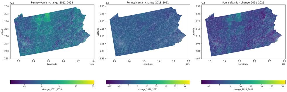
Tree canopy cover change was measured over a ten-year period using NLCD’s datasets for 2011 and 2021. Gentrification data was provided by Dr. Wiese. The first step is to extract and calculate tree canopy cover changes over the years for a particular state based on user input (Pennsylvania is used as an example for this post), and export that data as an Excel file.
Click on the arrow to view script
import geopandas as gpdimport rasteriofrom rasterio.mask import maskimport numpy as npimport matplotlib.pyplot as pltimport pandas as pdfrom shapely.geometry import boxdef extract_tracts_for_state(shapefile_path, state_name): # Read the shapefile gdf = gpd.read_file(shapefile_path) # Filter the GeoDataFrame to include only the specified state state_gdf = gdf[gdf['STATE_NAME'] == state_name] return state_gdfdef calculate_average_raster_values(raster_paths, tracts_gdf): for year, raster_path in raster_paths.items(): average_values = [] with rasterio.open(raster_path) as src: raster_bounds = box(*src.bounds) for tract in tracts_gdf.geometry: # Check if the tract overlaps with the raster bounds if not tract.intersects(raster_bounds): average_values.append(np.nan) continue # Mask the raster with the current tract try: out_image, out_transform = mask(src, [tract], crop=True) # Calculate the average value of the masked area if out_image.size > 0: average_value = np.mean(out_image[out_image > 0]) # ignoring no-data values else: average_value = np.nan average_values.append(average_value) except ValueError: # Handle the case where the tract does not overlap the raster average_values.append(np.nan) # Add the average values for the current year to the GeoDataFrame tracts_gdf[f'average_raster_value_{year}'] = average_values return tracts_gdfdef calculate_raster_value_changes(tracts_gdf): tracts_gdf['change_2011_2018'] = tracts_gdf['average_raster_value_2018'] - tracts_gdf['average_raster_value_2011'] tracts_gdf['change_2018_2021'] = tracts_gdf['average_raster_value_2021'] - tracts_gdf['average_raster_value_2018'] tracts_gdf['change_2011_2021'] = tracts_gdf['average_raster_value_2021'] - tracts_gdf['average_raster_value_2011'] return tracts_gdfdef plot_choropleth_maps(tracts_gdf, columns, state_name): fig, axes = plt.subplots(1, len(columns), figsize=(20, 10)) for ax, column in zip(axes, columns): tracts_gdf.plot(column=column, ax=ax, legend=True, legend_kwds={'label': column, 'orientation': "horizontal"}, cmap='viridis') ax.set_title(f'{state_name} - {column}') ax.set_xlabel('Longitude') ax.set_ylabel('Latitude') plt.tight_layout() plt.show()if __name__ == "__main__": # Replace 'path_to_shapefile.shp' with the path to your shapefile shapefile_path = 'data/tracts.shp' # Dictionary of raster files with their respective years raster_paths = { 2011: 'data/nlcd_tcc_conus_2011_v2021-4.tif', 2018: 'data/nlcd_tcc_conus_2018_v2021-4.tif', 2021: 'data/nlcd_tcc_conus_2021_v2021-4.tif' } # Take state name as user input state_name = input("Enter the state name: ") # Extract tracts for the specified state tracts_gdf = extract_tracts_for_state(shapefile_path, state_name) # Calculate the average raster values for each year tracts_with_avg_values = calculate_average_raster_values(raster_paths, tracts_gdf) # Calculate the raster value changes tracts_with_changes = calculate_raster_value_changes(tracts_with_avg_values) # Display the GeoDataFrame as a table print(tracts_with_changes.head()) # Display the first few rows of the GeoDataFrame # Uncomment the line below to display the entire GeoDataFrame # print(tracts_with_changes.to_string()) # Plot choropleth maps for all changes plot_choropleth_maps(tracts_with_changes, ['change_2011_2018', 'change_2018_2021', 'change_2011_2021'], state_name) # Export the updated GeoDataFrame to an Excel file tracts_with_changes.to_excel(f'{state_name}_tracts_with_avg_values_and_changesblog.xlsx', index=False) print(f"GeoDataFrame exported as {state_name}_tracts_with_avg_values_and_changes.xlsx")The above script masks the raster files to the shapefile of the state and calculates average values for each tract for the given years. It then proceeds to calculate the value changes over the years and outputs them in the form of an Excel file and series of maps.

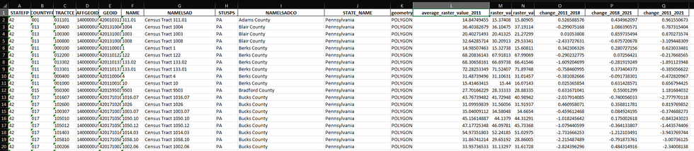
This dataset is then joined with the gentrification data using an inner join on the 'GEOID' field, and Philadelphia metro areas are filtered to create and export a new dataset containing tree canopy cover change and gentrification data.
Click on the arrow to view script
#%%import pandas as pd# Load the Excel filepa_tracts_df = pd.read_excel('Pennsylvania_tracts_with_avg_values_and_changes.xlsx')# Load the CSV filemetro_usa_df = pd.read_csv('gen_metro_usa.csv')#%%# Display the first few rows of each dataframeprint(pa_tracts_df.head())print(metro_usa_df.head())# Check the columns and data typesprint(pa_tracts_df.info())print(metro_usa_df.info())#%%merged_df = pd.merge(pa_tracts_df, metro_usa_df, on='GEOID', how='inner')# Display the first few rows of the merged dataframeprint(merged_df.head())# Summary statisticsprint(merged_df.describe())# Check for missing valuesprint(merged_df.isnull().sum())#%%# Filter the merged dataframe for rows where the 'Metro' field is 37980filtered_df = merged_df[merged_df['Metro'] == 37980]# Display the first few rows of the filtered dataframeprint(filtered_df.head())# Optionally, check the size of the filtered dataframe to ensure the filtering worked as expectedprint(filtered_df.shape)#%%%PhillyTCCGent = filtered_dfPhillyTCCGent.to_csv('PhillyTCCGent.csv', index=False)
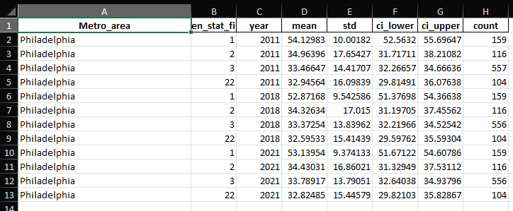
The resulting dataset is used to run spatial and statistical analyses. It is loaded into a GeoDataFrame for spatial analysis. The script calculates summary statistics (mean, count, standard deviation) for greenspace changes in different years (2011, 2018, 2021) based on gentrification status. The code compiles the statistics for all years into a single DataFrame and exports it to an Excel file. A map is plotted to visualize greenspace changes across Philadelphia, with different colors representing various gentrification statuses. Finally, the code runs a regression analysis to model the relationship between greenspace changes and gentrification status, treating the gentrification status as a categorical variable.
Click on the arrow to view script to run the analyses
import pandas as pdimport geopandas as gpdfrom shapely import wktimport numpy as npimport scipy.stats as statsimport matplotlib.pyplot as pltfrom matplotlib.patches import Patchimport seaborn as snsimport statsmodels.api as smimport statsmodels.formula.api as smfdef load_data(filepath): """Load the data from CSV and convert to GeoDataFrame.""" data = pd.read_csv(filepath) data['geometry'] = data['geometry'].apply(wkt.loads) data_gdf = gpd.GeoDataFrame(data, geometry='geometry') return data_gdfdef calculate_statistics(df, year): """Calculate statistics for a specific year and return a summary DataFrame.""" groups = df.groupby('gen_stat_fin')[f'average_raster_value_{year}'] stats_summary = groups.agg(['mean', 'count', 'std']) ci95 = stats_summary.apply(lambda row: stats.t.interval(0.95, row['count'] - 1, loc=row['mean'], scale=row['std'] / np.sqrt(row['count'])) if row['count'] > 1 else (np.nan, np.nan), axis=1) stats_summary['ci_lower'], stats_summary['ci_upper'] = zip(*ci95) stats_summary = stats_summary.reset_index() stats_summary['year'] = year return stats_summarydef compile_statistics(df): """Compile statistics for multiple years and combine them into a single DataFrame.""" stats_2011 = calculate_statistics(df, 2011) stats_2018 = calculate_statistics(df, 2018) stats_2021 = calculate_statistics(df, 2021) all_stats = pd.concat([stats_2011, stats_2018, stats_2021]) all_stats['Metro_area'] = 'Philadelphia' all_stats = all_stats[['Metro_area', 'gen_stat_fin', 'year', 'mean', 'std', 'ci_lower', 'ci_upper', 'count']] return all_statsdef export_statistics(stats_df, output_path): """Export the statistics DataFrame to an Excel file.""" stats_df.to_excel(output_path, index=False) # print(f'Statistics exported to {output_path}')def plot_map(df, color_palette): """Plot the map showing greenspace changes and gentrification status.""" df['color'] = df['gen_stat_fin'].map(color_palette) fig, ax = plt.subplots(1, 1, figsize=(10, 10)) # Plot the base map with greenspace changes df.plot(column='change_2011_2021', ax=ax, legend=False, cmap='Greens', alpha=0.9, edgecolor='black', linewidth=0.1) # Overlay gentrification status with distinct colors and thicker boundaries for category, color in color_palette.items(): subset = df[df['gen_stat_fin'] == category] subset.plot(ax=ax, facecolor="none", edgecolor=color, linewidth=0.5) # Customize the legend handles = [Patch(facecolor='none', edgecolor='black', label='Boundary')] for category, color in color_palette.items(): handles.append(Patch(facecolor='none', edgecolor=color, label=f'Gentrification Status {category}', linewidth=1)) # Add legends for both greenspace changes and gentrification status plt.legend(handles=handles, title='Gentrification Status', loc='lower right') # Add colorbar for greenspace changes sm = plt.cm.ScalarMappable(cmap='Greens', norm=plt.Normalize(vmin=df['change_2011_2021'].min(), vmax=df['change_2011_2021'].max())) sm._A = [] cbar = plt.colorbar(sm, ax=ax, fraction=0.03, pad=0.04) cbar.set_label('Change in Greenspaces 2011-2021') plt.title('Change in Greenspaces 2011-2021 and Gentrification Status in Philadelphia') plt.xlabel('Longitude') plt.ylabel('Latitude') plt.grid(True) # Add grid lines plt.show()def run_regression(df): """Run a regression model on greenspace changes and gentrification status.""" formula = 'change_2011_2021 ~ C(gen_stat_fin)' model = smf.ols(formula, data=df).fit() print(model.summary())def main(): # Define the file path and output path filepath = 'PhilTCCGent.csv' output_path = 'data/Greenness_Statistics_Philadelphiab.xlsx' # Define the color palette for gentrification status color_palette = {1: "red", 2: "blue", 3: "yellow", 22: "purple", 99: "orange"} # Load the data philly_data_gdf = load_data(filepath) # Calculate and export statistics all_stats = compile_statistics(philly_data_gdf) export_statistics(all_stats, output_path) # Plot the map plot_map(philly_data_gdf, color_palette) # Run regression analysis run_regression(philly_data_gdf) # Optionally, print statistics print(all_stats)# Run the main functionif __name__ == "__main__": main()


In the coming weeks I will be working on automating the interaction between the various scripts by turning them into modules, and creating a 'master script' to improve the organization and flow of the program.
Yesh has done a remarkable job with this application.